Below are my definite design decisions that I have come to which will give my final book a clear aesthetic and easy eye- flow. As my book is on women in the 1960s, this has reflected my design decisions, I have made sure they are appropriate for my publication, by looking into whether the type would be around in the 1960s.
1. Font
Headers
For my headers I used Bebas Neue, its a punchy clear font.
Folio System
The typeface is drawn as an extra bold weight of Cooper Old Style. Though not based on a single historic model, Cooper Black exhibits influences of Art Nouveau, Art Deco, and the Machine Age. Cooper Black was a predominant lettering style popularized by Oswald Bruce Cooper in Chicago and the Midwest of America in the 1920s, given typographic form. An earlier weight of Cooper's type designs, Cooper Old Style (later just "Cooper") was released first, though Cooper Black was what BB&S foundry was after. Cooper Black was advertised as being "for far-sighted printers with near-sighted customers", as well as "the Black Menace" by detractors.
2. Stock
'Antique White' - A grainy, off-white stock, which will give my images a certain grainy look which I want . I want it to be
3. Binding Method
Saddle Stitch, give a unique aesthetic.
4. Size
A5 - Purely because it is a traditional zine size.
Notably it was used in Dad's Army during the 60s.
Body Text
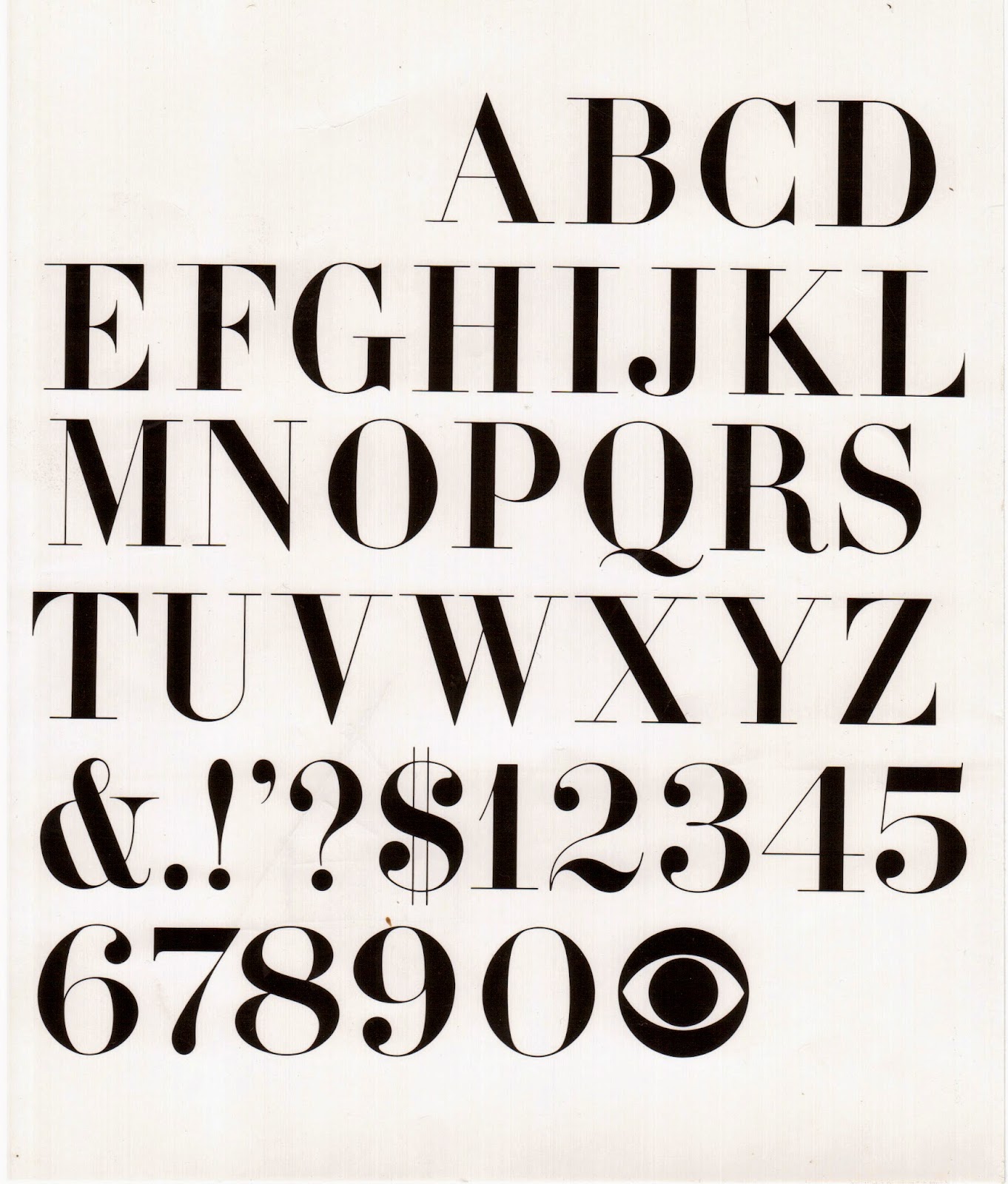
I've chosen Didot as my body text as it is a vintage font with a distinct look.
2. Stock
'Antique White' - A grainy, off-white stock, which will give my images a certain grainy look which I want . I want it to be
3. Binding Method
Saddle Stitch, give a unique aesthetic.
4. Size
A5 - Purely because it is a traditional zine size.


No comments:
Post a Comment