Tuesday, 22 April 2014
Interim Crit
Today, I presented my speaking from experience work in a small group. We discussed each others concepts and whether they work. They liked my idea, it was suggested that I look into different paper stock as well as book bind techniques and colour. They liked the idea of it being A5 in size. Below I have developed an action plan for the week.
ACTION PLAN
Tuesday:
Page Layout Thumbnail
Wednesday:
Design page layouts
Thursday
Finalise
Digital print booked at 6pm
Friday
Bind book together
Monday, 21 April 2014
OUGD406: Personal Organisation I use
Moleskine Diary
Along with the days of the week, the right size is left blank, which is useful for me to note things I need to do and write down any addresses/emails, shopping lists etc.
Another really nice touch are these stickers which makes important deadlines, birthdays stand off the page.
iCal
The iCal application is apples method to personal planning/organisation, it comes with pretty much all apple products. You can label things in different colours, rank things etc...
The yearly page helps distinguish planning over the year, deadlines, holidays etc.
The daily view gives much more info than on the app, but organises it in a really nice way, giving the user information about the date, month, and events for the day. It is extremely helpful when planning a busy day when a deadline is approaching.
Monthly overview
This weekly view is helpful for creating a plan of action.
Sunday, 20 April 2014
OUGD401: Links
http://issuu.com/vanessacain/docs/book
Here is the link to my book on Issuu
http://abriefhistoryofwomen1960.tumblr.com/
and my tumblr
Here is the link to my book on Issuu
http://abriefhistoryofwomen1960.tumblr.com/
and my tumblr
OUGD401: Design Decisions
Design Decisions
Below are my definite design decisions that I have come to which will give my final book a clear aesthetic and easy eye- flow. As my book is on women in the 1960s, this has reflected my design decisions, I have made sure they are appropriate for my publication, by looking into whether the type would be around in the 1960s.
1. Font
For my folio system I used Cooper Black, purely becauseCooper Black is a heavily weighted, old style serif typeface designed by Oswald Bruce Cooper in 1921 and released by the Barnhart Brothers & Spindler type foundry in 1922.
Below are my definite design decisions that I have come to which will give my final book a clear aesthetic and easy eye- flow. As my book is on women in the 1960s, this has reflected my design decisions, I have made sure they are appropriate for my publication, by looking into whether the type would be around in the 1960s.
1. Font
Headers
For my headers I used Bebas Neue, its a punchy clear font.
Folio System
The typeface is drawn as an extra bold weight of Cooper Old Style. Though not based on a single historic model, Cooper Black exhibits influences of Art Nouveau, Art Deco, and the Machine Age. Cooper Black was a predominant lettering style popularized by Oswald Bruce Cooper in Chicago and the Midwest of America in the 1920s, given typographic form. An earlier weight of Cooper's type designs, Cooper Old Style (later just "Cooper") was released first, though Cooper Black was what BB&S foundry was after. Cooper Black was advertised as being "for far-sighted printers with near-sighted customers", as well as "the Black Menace" by detractors.
2. Stock
'Antique White' - A grainy, off-white stock, which will give my images a certain grainy look which I want . I want it to be
3. Binding Method
Saddle Stitch, give a unique aesthetic.
4. Size
A5 - Purely because it is a traditional zine size.
Notably it was used in Dad's Army during the 60s.
Body Text
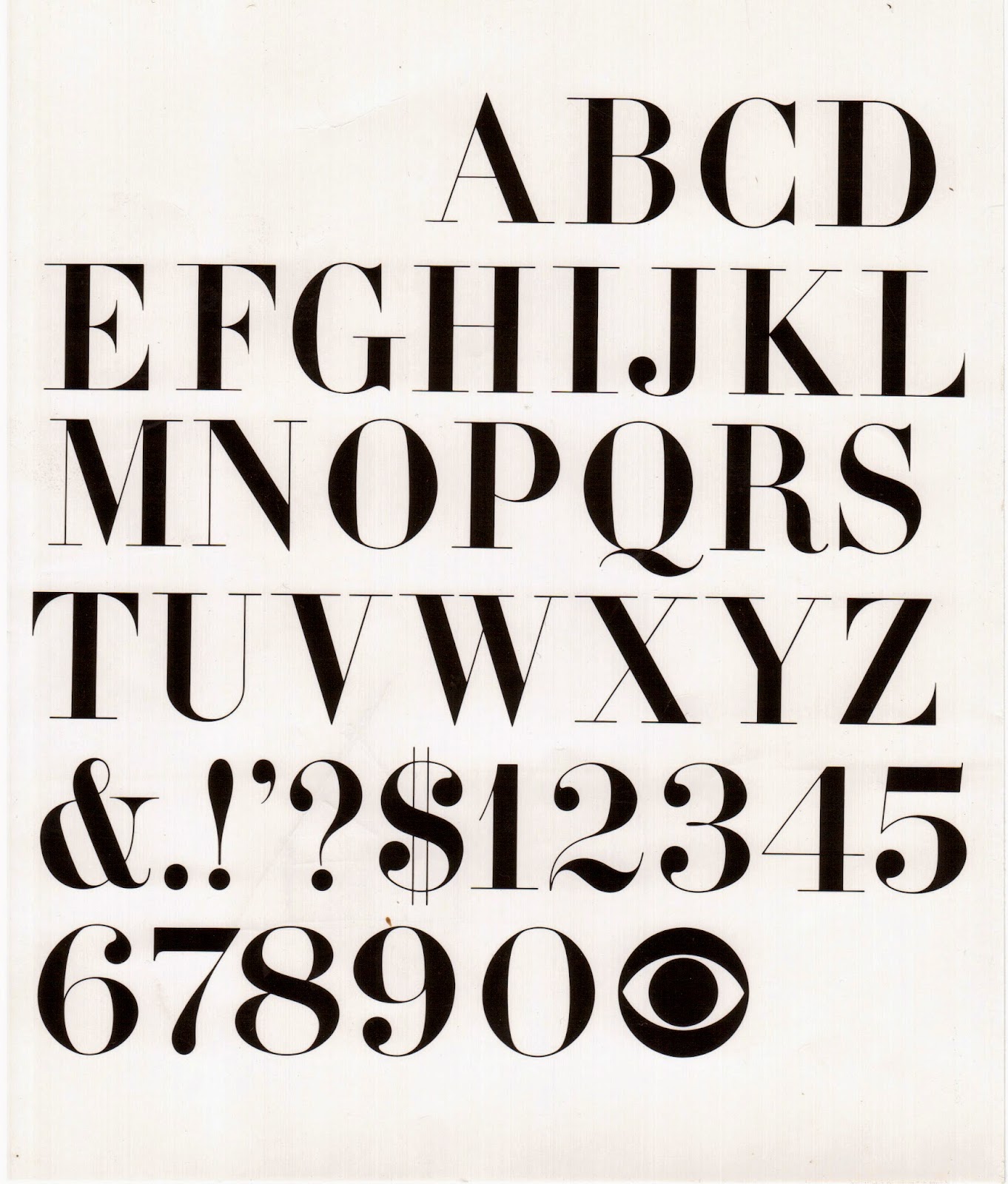
I've chosen Didot as my body text as it is a vintage font with a distinct look.
2. Stock
'Antique White' - A grainy, off-white stock, which will give my images a certain grainy look which I want . I want it to be
3. Binding Method
Saddle Stitch, give a unique aesthetic.
4. Size
A5 - Purely because it is a traditional zine size.
Friday, 11 April 2014
OUGD401: Binding Techniques
Binding Techniques
research into different binding methods that would be appropriate for 'A brief history of 1960s women' ...
 |
| Elastic Band |
 |
| Perfect Bind |
 |
| Spiral Bound |
 |
| Stitch |
 |
| Saddle Stitch |
I was thinking of stitching it like above, I could use different coloured threads to the stock to create an interesting aesthetic like they have done above. This is because I want to show that some care has gone into it, i want the book to be something people want to keep and i don't feel that stapling the book does this. I think it gives it a unique quality and feel to it.
Thursday, 10 April 2014
OUGD401: 1960 Photographs
Revisited
Instead of posting all the images on my blog I have set up a tumblr account that will go along with my book.
Selection of Images
Tuesday, 1 April 2014
OUGD406: speaking from experience
Brief Re-written
To create a publication for first year graphic design students which will provide time-management tips, calendar, crit info, print methods, basic glossary and design blogs.
To create a publication for first year graphic design students which will provide time-management tips, calendar, crit info, print methods, basic glossary and design blogs.
Subscribe to:
Posts (Atom)


