Showing posts with label OUGD403. Show all posts

Thursday, 14 November 2013

Summary Evaluation

OUGD403 Evaluation

Over the module, I have learnt a lot and have enjoyed my time at LCA so far. I've learnt a lot about typography, such as, the difference between a font and typeface! as well as learning the terminology behind it. I think this was incredibly useful as it will benefit my knowledge and hopefully my career in the future. 

I found the most challenging brief was to design a typeface for my chosen partner and portraying their personality through a set alphabet with 5 glyphs. However, I am happy with what I produced and I think it does reflect my partner taste in music. 

If I were to have more time on the module I would like re-visit my three posters, because I think I can make them of more high impact and I would really like to get them digitally printed instead of normal paper mounted onto card. 

Overall, I am really pleased with how the module has gone and I look forward to our next. For next time, I would like to experiment more, perhaps with mono or screen print and more hands on techniques. 

Wednesday, 6 November 2013

Interim Crit

This afternoon, we had an interim crit for our message delivery brief, the three posters. We were divided into two groups, I was in the first group, we lay out our work (thumbnails sketches/mock ups) onto tables and the second group gave us anonymous feedback on post-it notes attached to our work. It was an interesting way of presenting our work as we were not there, our work had to speak for itself we could not justify our design choices. 


Here is the feedback I received: 
  • Really strong designs. I love the half brain one. I think it communicates autism well, maybe think about neon pink? The trapped idea works well as the image poster. Upside down autism shows being confused. 
  • Good, consider type layout as curved 'Autism Affects' may not be necessary 
  • Work on text only posters- keep body copy out of poster. Big up caged brain idea! 
  • I like the keyed mouth idea. And the idea for info graphics is strong
  • Look into 'Brain Art' online. There is an infamous advert of (creative vs logical) part of the brain, that will help with this concept
  • Works well, simple and effective. When producing could use different type for "ONE". Like the composition.
  • Think your ideas are really simple but effective. Really like the 1 in 50 as it explains well. Not sure whether this is final, but not sure on the pink? 
  • Could you combine ideas of 1 in 50 and Boys are 4x more likely to have autism than girls?
  • Simple and effective. The idea of an info graphic is good, also really like the 'trapped' poster.
  • Brain inside a cage is a great visualisation of autism, whereas the other two are confusing without context. Lots of other connotations
  • I like this, perhaps add a strap line
  • Upside down 'Autism' does communicate seeing things differently, but when shown with another, right way up 'Autism' it also connotes reflection mirror image etc. 
  • Maybe think of ways of writing that are different without being wrong
  • 'One person with' would work better with more explanation. Like the brain in a cage. 'Autism' sideways is clever but needs more explanation 
  • I like this idea of 'one in fifty' this is clear, like the more simple ideas because autism is complex
  • Look at adjusting the 'one in fifty' poster so that they all face one way and the autistic person faces the other way? 
From the feedback I received was of use and will be taken into consideration it was very helpful. I now have time to make some final tweaks on my posters before our final crit this Friday. 

Tuesday, 5 November 2013

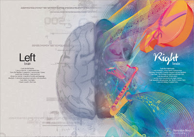
Brain Advert: Mercedez Benz


Great art, great concept, great execution.

Brain Ad: Mercedes Benz

Brain Ad: Mercedes Benz

Brain Ad: Mercedes Benz

A fantastic series of illustrations from an advertising campaign by Mercedes Benz. Not strictly accurate going by modern science, but a great depiction of the concept, this is more or less pop-psychology. I think they have represented and tackled logic vs. visual very well. However, this to me could be an advert for anything, I don't really get the link with Mercedes. I think they wanted to convey that the left and right side of the brain would be thrilled with a new Mercedes but that message isn't clear. 

This is inspiring to me as in my thumbnail sketches I have been drawing the two hemispheres of the brain, as a visual image for autism.  However, unfortunately I don't have enough time to create 'brain art' as illustrative as this! Although I think using simple graphics to raise awareness of such a complex disorder as autism could be an interesting concept to go down. 

Saturday, 2 November 2013

Artists Against Autism- AAA

Whilst researching I discovered a group called, Artists Against Autism (AAA). AAA is a non-profit organisation that provides a platform for big business to connect with artists e.g. graphic designers, art directors and copywriters. Revenues from creative services will be allocated to beneficiaries of Artists Against Autism (AAA).
Below are a set of posters designed by some of these artists, I really like the simplicity of these posters and the little colour used and how simple icons can be used to portray autism. I especially like the one on the right how autism has been reflected to show how it can be challenging. Its connotes how Autistic people view their world (using the metaphor of glasses) and how other people view them. I also like the caged brain idea and the heart padlock to open it, you get a sense of trapped emotion and not being able to portray your true potential (or at least have difficultly in doing so)

It is also only uses two colours as well as paper stock which I need to remember to consider when designing mine.
Social Design Posters

After looking at this I began researching artists with Autism, my best example being Stephen Wiltshire. Stephen Wiltshire is an artist who draws and paints detailed cityscapes, by remembering! He has a particular talent for drawing lifelike, accurate representations of cities, sometimes after only observed them briefly. As a child he was a mute, and did not relate to other people. Aged three, he was diagnosed as autistic. He had no language and lived entirely in his own world. Below is one of my favourite works of his, it is a panoramic view of New york/Manhattan skyline, incredible drawing from memory.


Albert Exergian: Poster Research

In the brief it specifies one of the three posters be type and image working together. Below are examples of Albert Exergian TV posters they're not necessarily portraying a message (which I need to do) but I thought they were good simple examples of how little and simplistic you can go with poster design yet still recognise what it is representing. An example here being The Simpsons poster a simple black zig zag and title you can easily recognise it by the colour yellow and Homer Simpsons hair! The posters are all of high impact. 

Also, Albert Exergian's poster use only little colour, two at most plus the paper stock. Something I need to take into careful consideration when designing mine because I still want them to be eye-catching and of high impact. 


Friday, 1 November 2013

Illustrator


This morning, I purely had a play around creating depth to the letterform A. What I've actually created looks totally ugly but it was useful to me as I'm getting to grips with how things on Illustrator work. I used effects on the rotate options like extrude & bevel and expanding appearances. For my final depth alphabet I think I will use a lot of layered opacity to create actual depth to my letterforms. 

Monday, 28 October 2013

Stonewall: Poster Research

For our poster brief we are only to use 2 colours plus paper stock. A good example of this ( suggested by Simon) was how effective the Stonewall poster, 'Some people are gay. Get over it!' which only uses two colours and just typography. The iconic Stonewall's poster campaign delivers a short, to-the-point, zero tolerance statement to tackle homophobia across the UK. It is a very loud and eye-catching poster which emphasises the message it is portraying. 
I want this kind of short blunt message in my posters as I don't want anything to long-winded as it wouldn't be legible from afar. However, I would have to be very clear, precise and specific for it to actually work. 

Studio Brief 5


To begin my research into the brief I got three books out (suggested to us) from the library by Ambrose/Harris on Format,  Image and Typography as a starting point. 

Format/Typography/Image by Ambrose/Harris

Interim Crit

Todays crit, I presented my research into autism and art therapy. It confirmed to me I was on track with my research and had a good news story. Overall it went very well, and I felt positive. It was really interesting listening to what everybody had to say about their news story. I've enjoyed looking into great depth about whats happening in the news. Things that I should think about: 
  • How to make my research visual? 
  • Look into info-graphics 
Notes

Friday, 25 October 2013

Understanding Autism

What is Autism? 

  • Autism are lifelong disabilities that, at their core, affect a person's social and communication abilities. 
  • People with autism may engage in repetitive actions, for example lining up objects or have specific interests or thoughts that can dominate their lives. Some people with autism find their sensory world unusual and occasionally anxiety provoking. 
  • Autism can come with a range of challenges in making sense of the world but it can also give people advantages, such as memory or in concentrating on tasks. 
  • The autism spectrum is very broad. Some people have no language, intellectual difficulties and not engage with others. Other people on the autism spectrum may have very good or even advanced language skills but find the rules governing social behaviour hard to fathom. 
  • Boys are four times more likely to be diagnosed with autism than girls- this related to my news story with Harry Reid 
  • Autism affects people of all racial, ethnic backgrounds
  • Many individuals on the autism spectrum have additional medical conditions such as epilepsy, sleep difficulties and other mental health problems.
I have a much more clearer understanding of what Autism is, so I went on to collect more facts about Autism.

  • 90% of parents of children with Autism (and Asperger Syndrome) report their child has been a target of bullying in the past year 
  • 1 in 5 children with Autism have been excluded from school - relates to Harry Reid in my news story
  • Only 15% of adults with autism are in full time paid employment 
  • Half of adults with Autism still live with their parents

Each year, Autism costs families and public services some £28 billion in the UK. Of this: 
  • £15 billion provides services for adults
  • £9.2 billion is the cost of lost employment
  • £2.7 billion is the cost of supporting children of autism in their education

The remaining costs are the additional family expenses. Harry Reid in my news story is also a sufferer of Attention Deficit Hyperactivity Disorder (ADHD) 

  • Effects 5% of children
  • HIgh levels of inattention/short attention spans
  • Treatment behaviour management 
  • Many parents also report excellent results from a modified diet 
  • Suffer hyperactivity and impulsiveness, meaning they fidget, talk too much, and find it difficult to wait their turn. 

Crit Feedback

I found todays crit feedback really helpful and useful as I previously found I was running low of how to take Rebecca's alphabet further. Today's crit was different to usual: we simply left our work out on the table and everyone went round clockwise and wrote feedback and suggestions down on paper. It was good to receive personal feedback from everyone in the group who might have been to shy to voice their opinions. Suggestions that came up repeatedly that I should improve or try out on were: 

  • Look into grunge font/letterforms
  • Look at the music she likes (posters etc) 
  • Look into Fashion/Music fonts
  • Verve STD. seems quite passive...

Feedback Sheet
To move forward with this project I shall develop some of the ideas suggested to me. I think looking looking into grunge fonts and the bands Rebecca likes could be an interesting concept to develop on. 

Thursday, 24 October 2013

The Naughtiest School Boy: Chosen News Article

Taken from Daily Mail 
Taken from Daily Star

I've decided to pick the story on Harry Reid nick-named, "the naughtiest school boy'. He was excluded from his local primary school aged only 5 years old, which shocked me as he is so young! What shocked me (when reading into it) was that Harry had Attention Deficit Hyperactive Disorder (ADHD) as well as Autism! What upset me was Harry gets frustrated in social situations yet the school had no system in place to deal with him. Another shocking fact was the school has an outstanding rating and having a problem child such as Harry, would not help that (which is what I think is the main reasons why he got excluded) A spokesman for the school said: 'The decision to excluded a child is not taken lightly and is only ever and absolute last resort. A figure I found out was that has been released earlier this year suggests that permanent exclusions from primary schools are on the rise! 

As I had the same news story yet reported in the Daily Mail and Daily Star (both tabloids) I could read both and draw on comparisons in the way they have chosen to report the story. The first thing I immediately noticed was the different choice in photos to go with the article. The Daily Star has gone for a really cheesy informal photograph of Harry Reid looking glum yet quite innocent, whereas The Mail has gone for a formal school portrait. 

The use of language is different also, The Star uses an informal tone-of-voice and also on first name basis calling Harry's mother, 'mum' and 'Debbie' in comparison with The Mail 'Mother' and 'Mrs Reid'. The Daily Star's tone-of-voice connotes a certain loudness and brash language, for example, 'son dubbed Dennis The Menace  to add a shock factor. Also in The Star's headline, 'I'm Britain's naughtiest boy...EVER', is in first person (informal) and 'EVER' is capitalised and in red, which connotes boldness, as well as being eye catching. An ellipsis ( ... ) is used to create suspension. The Daily Mail has a lot more detail concerning Harry and his mother. 

Another difference I noticed was the headline font. The Daily Mail uses a sans-serif Roman font which I guess connotes formal feel. In comparison with The Daily Star which uses a slab- sans serif which portrays a heavy feel, with blunt ends... I suppose from afar your eye would be more drawn to The Daily Star as it is more legible and has a lot less writing. 

The reason why I have chosen this news story is because I am interested in understanding the psychology behind Autism ( something I only touched upon in A level Psychology) I'm also interested in raising awareness of Autism as I feel people don't understand the disorder which affects a lot of individuals. 


Mind-Map Comparing News Articles


I've decided to look up at the news story on Daily Mail online and read through the reader comments to get a different perspective on the article. 


A lot of the comments argued that Harry Reid was a pest and said it was down to bad parenting. However, there were some comments from parents who had children with adhd and autism who sympathised. 

Verve Std.


Beginning to manipulate letterforms to reflect Rebecca's alternative and indie music tastes, I especially like the 3D letter C, I feel you could see it being used on posters and as header text, by making it look 3D i suppose it creates a depth to her personality. 

With the other C I tried to create a glossy look by adding white lines to the ascender. I definitely feel hand-rendering my typeface to make it more illustrative is the best option to accurately reflect Rebecca's personality as she is quite alternative. I really feel Verve Std. echoes Rebecca's personality. 

Wednesday, 23 October 2013

Rebecca's Music Interests

One thing that I believe is that an individuals music preferences represent their own personality as such I have decided to research into Rebecca's music likes. I already know what bands she likes. I have managed to collect some logos and typography relating to her favourite bands. 

Arcade Fire

Arctic Monkeys

Babyshambles

The Beatles

The Who

Rebecca's taste in music (which is mainly indie) has given me an insight into what entertains her and the genres of music that she is interested in, this will help me in designing a typeface for her.

Red

Looking at a variety of newspapers, one thing I have noticed in particular is a lot of red titles in tabloid newspapers especially. Below are my examples...


Daily Mirror  
The Sun

Daily Star
Connotations of red: 

  • Anger
  • Courage
  • Love/Passion 
  • Heat
  • Courage 
  • Danger
  • Republican
I don't think any of these connotations to me suggest why tabloid newspapers use the colour red for their headlines. I think purely the colour red is mainly used to attract readers with the sensationalised headlines because its bold and eye-catching. I think the connotation of anger would fit in with tabloid newspapers as they do express articles with a one-sided angry view, which reflects the colour red and loudness and brash articles in the newspapers. 

Tuesday, 22 October 2013

Researching a News Article

Tuesday 22nd October 2013 Newspapers

The aim of this brief is to research. This afternoon I bought a few tabloid and broadsheet newspapers purchased on 22/10/2013. My aims are to read through them and chose a news article. I can chose any article I like, however we warned against choosing a depressing subject as we will have to present them. 

I purchased five newspapers (The Guardian, Daily Mail, Daily Star, Daily Mirror and The Sun) I decided that by buying five I could compare the different newspapers and the market aimed at. Also if my chosen news article might be reported in different ways in different newspapers which could be interesting. 


The majority of the newspapers have different story running on each front page. However, The Sun and The Guardian have got the same photograph of the mysterious blonde girl named Maria found in a gyspy roma camp with the couple accused of abducting her. The Daily Star has gone for a headline to shock the reader 'killer spider made my leg explode' as well as a graphic photo of the leg. The Daily Mirror has gone with the shocking news story about the 'White Widow', a mum who's ambitions for her son was to become a suicide bomber. 

Its interesting how newspapers use larger images or larger amounts of text to grasp the different audience. 

Rebecca Kelly

Mindmap of Rebecca's Likes and Characteristics

I created a mind map of Rebecca's likes and characteristics to eventually choose a typeface to reflect her personality. 

I first began by looking into the connotations of her favourite colours. The colour green symbolises the colour of nature it also symbolises self-respect and well-balanced being.  It is also often used in hospitals and mental health units to create a calming atmosphere. The colour purple symbolises good judgement. The findings from these colouring meaning reflect some of the answers she gave, it also reinforces the theme of comfort.

Adobe Font Finder

I found the Adobe Font Finder website to try and find an existing font that has similar characteristics to represent Rebecca. Adobe Font Finder can help you narrow down your search by categorising the fonts into different styles and characteristics. I used options of sans serif, contemporary and logo.
Verve Std. Font

I really love this font called 'Verve Std' I feel it reflects her personality and echoes her handwriting. It's a very contemporary font, which I feel reflects her alternative dress sense and music taste. I think this is the font I will probably use as the basis of her alphabet. There is a really nice balance between curve and line to the type which reflects her well-balanced personality. 
Rockwell Font
I decided to look at Rockwell for a font for Rebecca as it is the font used for the Leeds festival which she said was her favourite place in the world. I'm unsure on the typeface though, it is quite brash and bold. I won't be using this font.

Newspaper Research

Mind-maps from book

As part of my Message delivery brief  I will research different British newspapers with a brief summary look at their formats, layout, design and political leaning. First I looked into the types of British newspapers, online websites and news programmes out there: 

Broadsheet:                                 

  • Guardian
  • Telegraph
  • Times
  • Financial Times
Tabloid:
  • Metro
  • Sun
  • Mirror
  • Daily Star 
  • The People
Regional:
  • Express & Echo 
  • Yorkshire Post 
  • Express & Star 
  • Wigan Local 
  • Lancashire Telegraph 
News Programmes: 
  • BBC/Channel 4/ITV News
  • This Morning 
  • One Show 
  • Mock the Week 
  • 8 out of 10 Cats 
  • Loose Women 
Online News Sites: 
  • Reddit
  • This Morning 
  • Bing 
  • Google 
  • BBC News
  • Yahoo 
  • Fox 
  • Twitter/Facebook 
  • ITV News
Broadsheet newspaper: A broadsheet newspaper is the largest of newspaper formats characterised with long vertical pages and columns. It looks very traditional.  The Daily Telegraph is an example of a Broadsheet newspaper and is centre-right which is conservative. 

Tabloid newspaper: A tabloid newspaper has a compact page design a lot smaller than a broadsheet. 
An example of a tabloid newspaper is The Sun which focuses a lot on celebrity culture and gossip, its a very lively newspaper. The Sun is right-wing populism. It is the ninth-largest circulation of newspaper in the world.

Berliner: The Guardian is an example of a Berliner newspaper, it was the first newspaper to use the Berliner format in the UK. The Berliner format is slightly taller and marginally wider than the tabloids compact format yet narrower and shorter than the broadsheet format.

Freesheet: A newspaper which is free, for an example Metro (owned by the Daily Mail) contains a mix of articles. It contains bite size news rather than big political or world news. The mix of articles are about travel, home, style, celebrity life,  as well as extensive arts coverage and entertainment listings. Its a newspaper designed to read by commuters. The look of the Metro is a white background with a blue header, its designed to look easy legible. 

Saturday, 19 October 2013

Village Bookstore in Leeds


Today, I went to the village bookstore in the corn exchange, Leeds, to look at some graphic design magazines and zines for some inspiration. I bought printed pages magazine as it was suggested to me by my tutor. Its a lovely independent shop, I probably could have spent hours flicking through magazines. I will definitely be re-visiting there soon.