Showing posts with label Studio Brief 5. Show all posts

Wednesday, 6 November 2013

Interim Crit

This afternoon, we had an interim crit for our message delivery brief, the three posters. We were divided into two groups, I was in the first group, we lay out our work (thumbnails sketches/mock ups) onto tables and the second group gave us anonymous feedback on post-it notes attached to our work. It was an interesting way of presenting our work as we were not there, our work had to speak for itself we could not justify our design choices. 


Here is the feedback I received: 
  • Really strong designs. I love the half brain one. I think it communicates autism well, maybe think about neon pink? The trapped idea works well as the image poster. Upside down autism shows being confused. 
  • Good, consider type layout as curved 'Autism Affects' may not be necessary 
  • Work on text only posters- keep body copy out of poster. Big up caged brain idea! 
  • I like the keyed mouth idea. And the idea for info graphics is strong
  • Look into 'Brain Art' online. There is an infamous advert of (creative vs logical) part of the brain, that will help with this concept
  • Works well, simple and effective. When producing could use different type for "ONE". Like the composition.
  • Think your ideas are really simple but effective. Really like the 1 in 50 as it explains well. Not sure whether this is final, but not sure on the pink? 
  • Could you combine ideas of 1 in 50 and Boys are 4x more likely to have autism than girls?
  • Simple and effective. The idea of an info graphic is good, also really like the 'trapped' poster.
  • Brain inside a cage is a great visualisation of autism, whereas the other two are confusing without context. Lots of other connotations
  • I like this, perhaps add a strap line
  • Upside down 'Autism' does communicate seeing things differently, but when shown with another, right way up 'Autism' it also connotes reflection mirror image etc. 
  • Maybe think of ways of writing that are different without being wrong
  • 'One person with' would work better with more explanation. Like the brain in a cage. 'Autism' sideways is clever but needs more explanation 
  • I like this idea of 'one in fifty' this is clear, like the more simple ideas because autism is complex
  • Look at adjusting the 'one in fifty' poster so that they all face one way and the autistic person faces the other way? 
From the feedback I received was of use and will be taken into consideration it was very helpful. I now have time to make some final tweaks on my posters before our final crit this Friday. 

Tuesday, 5 November 2013

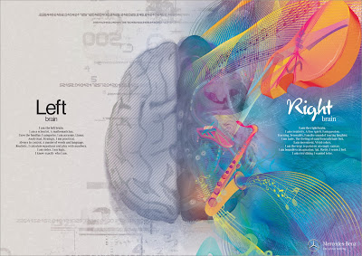
Brain Advert: Mercedez Benz


Great art, great concept, great execution.

Brain Ad: Mercedes Benz

Brain Ad: Mercedes Benz

Brain Ad: Mercedes Benz

A fantastic series of illustrations from an advertising campaign by Mercedes Benz. Not strictly accurate going by modern science, but a great depiction of the concept, this is more or less pop-psychology. I think they have represented and tackled logic vs. visual very well. However, this to me could be an advert for anything, I don't really get the link with Mercedes. I think they wanted to convey that the left and right side of the brain would be thrilled with a new Mercedes but that message isn't clear. 

This is inspiring to me as in my thumbnail sketches I have been drawing the two hemispheres of the brain, as a visual image for autism.  However, unfortunately I don't have enough time to create 'brain art' as illustrative as this! Although I think using simple graphics to raise awareness of such a complex disorder as autism could be an interesting concept to go down. 

Saturday, 2 November 2013

Albert Exergian: Poster Research

In the brief it specifies one of the three posters be type and image working together. Below are examples of Albert Exergian TV posters they're not necessarily portraying a message (which I need to do) but I thought they were good simple examples of how little and simplistic you can go with poster design yet still recognise what it is representing. An example here being The Simpsons poster a simple black zig zag and title you can easily recognise it by the colour yellow and Homer Simpsons hair! The posters are all of high impact. 

Also, Albert Exergian's poster use only little colour, two at most plus the paper stock. Something I need to take into careful consideration when designing mine because I still want them to be eye-catching and of high impact. 


Monday, 28 October 2013

Stonewall: Poster Research

For our poster brief we are only to use 2 colours plus paper stock. A good example of this ( suggested by Simon) was how effective the Stonewall poster, 'Some people are gay. Get over it!' which only uses two colours and just typography. The iconic Stonewall's poster campaign delivers a short, to-the-point, zero tolerance statement to tackle homophobia across the UK. It is a very loud and eye-catching poster which emphasises the message it is portraying. 
I want this kind of short blunt message in my posters as I don't want anything to long-winded as it wouldn't be legible from afar. However, I would have to be very clear, precise and specific for it to actually work.