Sunday, 10 November 2013

Type Analysis

Gotham Font- Masculine, New and Fresh


The font Gotham was created in 2000 by type designer Tobias Frere- Jones who drew inspiration and influences from post-war signage and hand-painted letters seen around New York City. Gotham was commissioned by men's fashion magazine GQ yo create a new typeface for this publication. The typeface Gotham connotes masculine, new and fresh. This description was taken from the Hoefler & Frere-Jones website and fits it so perfectly: "Gotham is that rarest of designs, the new typeface that somehow feels familiar. From the lettering that inspired it, Gotham inherited an honest tone that’s assertive but never imposing, friendly but never folksy, confident but never aloof." Gotham has only been around 12 years yet has made a lasting impact, it is also said it rivals Helvetica-  yet I disagree with this.

The font Gotham is perhaps most well-known from the successful Obama 2008 presidential campaign, as it does have a bold American feel to it. As well as it connotes confidence, boldness and a sort of determinedness  (as well as it has been used as the cornerstone of the One World Trade Centre- the tower to be built on the site of the former World Trade Centre), Hoefler and Fre-Johns. Gotham has been referred to as the typeface of the decade.

Gotham is a family of widely used geometric sans-serif typefaces, especially popular through out New York City. The lettering that inspired this typeface originated from the 1920s era sans-serif like Futura. It is a very new typeface that somehow feels very familiar. Gotham is a humanist font and very geometric. Recently, I have been noticing this typeface everywhere, I love how versatile it is. The typeface connotes confidence, not an arrogant confidence a really attractive confidence. 


Obama 2008 presidential campaign poster

Wednesday, 6 November 2013

Interim Crit

This afternoon, we had an interim crit for our message delivery brief, the three posters. We were divided into two groups, I was in the first group, we lay out our work (thumbnails sketches/mock ups) onto tables and the second group gave us anonymous feedback on post-it notes attached to our work. It was an interesting way of presenting our work as we were not there, our work had to speak for itself we could not justify our design choices. 


Here is the feedback I received: 
  • Really strong designs. I love the half brain one. I think it communicates autism well, maybe think about neon pink? The trapped idea works well as the image poster. Upside down autism shows being confused. 
  • Good, consider type layout as curved 'Autism Affects' may not be necessary 
  • Work on text only posters- keep body copy out of poster. Big up caged brain idea! 
  • I like the keyed mouth idea. And the idea for info graphics is strong
  • Look into 'Brain Art' online. There is an infamous advert of (creative vs logical) part of the brain, that will help with this concept
  • Works well, simple and effective. When producing could use different type for "ONE". Like the composition.
  • Think your ideas are really simple but effective. Really like the 1 in 50 as it explains well. Not sure whether this is final, but not sure on the pink? 
  • Could you combine ideas of 1 in 50 and Boys are 4x more likely to have autism than girls?
  • Simple and effective. The idea of an info graphic is good, also really like the 'trapped' poster.
  • Brain inside a cage is a great visualisation of autism, whereas the other two are confusing without context. Lots of other connotations
  • I like this, perhaps add a strap line
  • Upside down 'Autism' does communicate seeing things differently, but when shown with another, right way up 'Autism' it also connotes reflection mirror image etc. 
  • Maybe think of ways of writing that are different without being wrong
  • 'One person with' would work better with more explanation. Like the brain in a cage. 'Autism' sideways is clever but needs more explanation 
  • I like this idea of 'one in fifty' this is clear, like the more simple ideas because autism is complex
  • Look at adjusting the 'one in fifty' poster so that they all face one way and the autistic person faces the other way? 
From the feedback I received was of use and will be taken into consideration it was very helpful. I now have time to make some final tweaks on my posters before our final crit this Friday. 

Illustration

This morning we had a lecture on Illustration. Illustration can be described as strategic image-making, used within the context of visual communication to convey meaning or a concept. A point made was that concept with context has no meaning and vice versa. 


The visual aesthetic of an image, the look, tone and medium of the drawing style, is possibly as important in communication image itself. Illustration needs a voice to convey depth and meaning thus the quality of an illustration can be told from the emotions evoked by it. The difference between fine art and illustration is that fine art is a personal exploration (whatever they desire or compel to do) whereas illustration has more of an audience and work with clients to fit the brief.

Illustration comes in a wide variety of forms/mediums such as, painting, drawing, collage etc. However, it has to fit its message and make an impact on the viewer.Thus, coming back to the point of a concept without any context has no meaning and vice versa. 

Maurice Sendak

For an example, the illustrations of Maurice Sendak (where the wild things are) Although drawn in 1963 they still fit and have relevance and the illustrations fit the brief for a children's book and have an impact on child and adult viewers of today. 


Tuesday, 5 November 2013

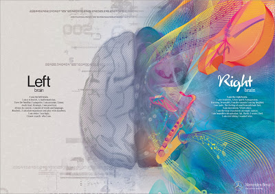
Brain Advert: Mercedez Benz


Great art, great concept, great execution.

Brain Ad: Mercedes Benz

Brain Ad: Mercedes Benz

Brain Ad: Mercedes Benz

A fantastic series of illustrations from an advertising campaign by Mercedes Benz. Not strictly accurate going by modern science, but a great depiction of the concept, this is more or less pop-psychology. I think they have represented and tackled logic vs. visual very well. However, this to me could be an advert for anything, I don't really get the link with Mercedes. I think they wanted to convey that the left and right side of the brain would be thrilled with a new Mercedes but that message isn't clear. 

This is inspiring to me as in my thumbnail sketches I have been drawing the two hemispheres of the brain, as a visual image for autism.  However, unfortunately I don't have enough time to create 'brain art' as illustrative as this! Although I think using simple graphics to raise awareness of such a complex disorder as autism could be an interesting concept to go down. 

Saturday, 2 November 2013

Artists Against Autism- AAA

Whilst researching I discovered a group called, Artists Against Autism (AAA). AAA is a non-profit organisation that provides a platform for big business to connect with artists e.g. graphic designers, art directors and copywriters. Revenues from creative services will be allocated to beneficiaries of Artists Against Autism (AAA).
Below are a set of posters designed by some of these artists, I really like the simplicity of these posters and the little colour used and how simple icons can be used to portray autism. I especially like the one on the right how autism has been reflected to show how it can be challenging. Its connotes how Autistic people view their world (using the metaphor of glasses) and how other people view them. I also like the caged brain idea and the heart padlock to open it, you get a sense of trapped emotion and not being able to portray your true potential (or at least have difficultly in doing so)

It is also only uses two colours as well as paper stock which I need to remember to consider when designing mine.
Social Design Posters

After looking at this I began researching artists with Autism, my best example being Stephen Wiltshire. Stephen Wiltshire is an artist who draws and paints detailed cityscapes, by remembering! He has a particular talent for drawing lifelike, accurate representations of cities, sometimes after only observed them briefly. As a child he was a mute, and did not relate to other people. Aged three, he was diagnosed as autistic. He had no language and lived entirely in his own world. Below is one of my favourite works of his, it is a panoramic view of New york/Manhattan skyline, incredible drawing from memory.


Albert Exergian: Poster Research

In the brief it specifies one of the three posters be type and image working together. Below are examples of Albert Exergian TV posters they're not necessarily portraying a message (which I need to do) but I thought they were good simple examples of how little and simplistic you can go with poster design yet still recognise what it is representing. An example here being The Simpsons poster a simple black zig zag and title you can easily recognise it by the colour yellow and Homer Simpsons hair! The posters are all of high impact. 

Also, Albert Exergian's poster use only little colour, two at most plus the paper stock. Something I need to take into careful consideration when designing mine because I still want them to be eye-catching and of high impact. 


Friday, 1 November 2013

Illustrator


This morning, I purely had a play around creating depth to the letterform A. What I've actually created looks totally ugly but it was useful to me as I'm getting to grips with how things on Illustrator work. I used effects on the rotate options like extrude & bevel and expanding appearances. For my final depth alphabet I think I will use a lot of layered opacity to create actual depth to my letterforms.